top of page


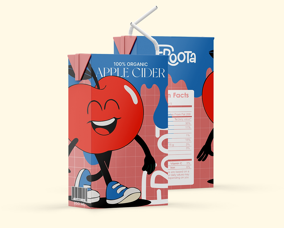
The Froota characters serve as the core ambassadors of the brand’s visual and emotional language. Designed with flat colors, thin contour lines, and bold body language, they make the brand instantly recognizable and memorable.Each character reflects a different mood and taste, allowing the brand to communicate variety, personality, and fun without relying on heavy messaging.Their presence across packaging, posters, and digital platforms creates a strong, playful continuity that kids connect with and parents remember.


The Froota project showcases how brand storytelling, character design, and bold visuals can come together to create an engaging, child-friendly identity. Through playful illustrations, vibrant colors, and a consistent visual language, the brand captures kids’ attention while conveying trust and natural values to parents. This project demonstrates the potential of building not just a product, but an entire branded world that can expand into packaging, merchandise, digital content, and beyond.

THANK YOU FOR MAKING IT THIS FAR, LET'S CREATE SOMTHING TOGEHTER!
The goal behind the branding was to create a visual identity that stands out in the crowded landscape of local bakeries. With a distinctive color palette, playful structure, and expressive tone, the brand was designed to catch the eye, break conventions, and leave a lasting impression. Every design choice - from the bold signage to the unexpected mix of colors - was made to ensure the bakery feels unmistakably different, while still warm, inviting, and easy to connect with.


The visual language combines nostalgic warmth with a modern twist, using bold typography, soft illustrations, and a vibrant yet delicate color palette. The use of rounded shapes, expressive layout, and a balance between cozy and contemporary makes the brand feel joyful, memorable, and full of flavor - just like the pastries it represents.

BRANDING
FICTIONAL PROJECT
JULY
2025
ILLUSTRAOR
PHOTOSHOP
DALL-E
VEO3
Nano Banana
MIDJOURNEY
Puff & Co. is a conceptual branding project for a vibrant, youthful bakery. The identity combines bold typography with playful color palettes and hand-drawn baking icons, creating a look that’s modern, fun, and instantly recognizable. The visual language is approachable yet distinctive, aiming to spark joy and appetite at first glance. This brand system was designed to work seamlessly across packaging, signage, and digital platforms.
PUFF&CO PROJECT
bottom of page