

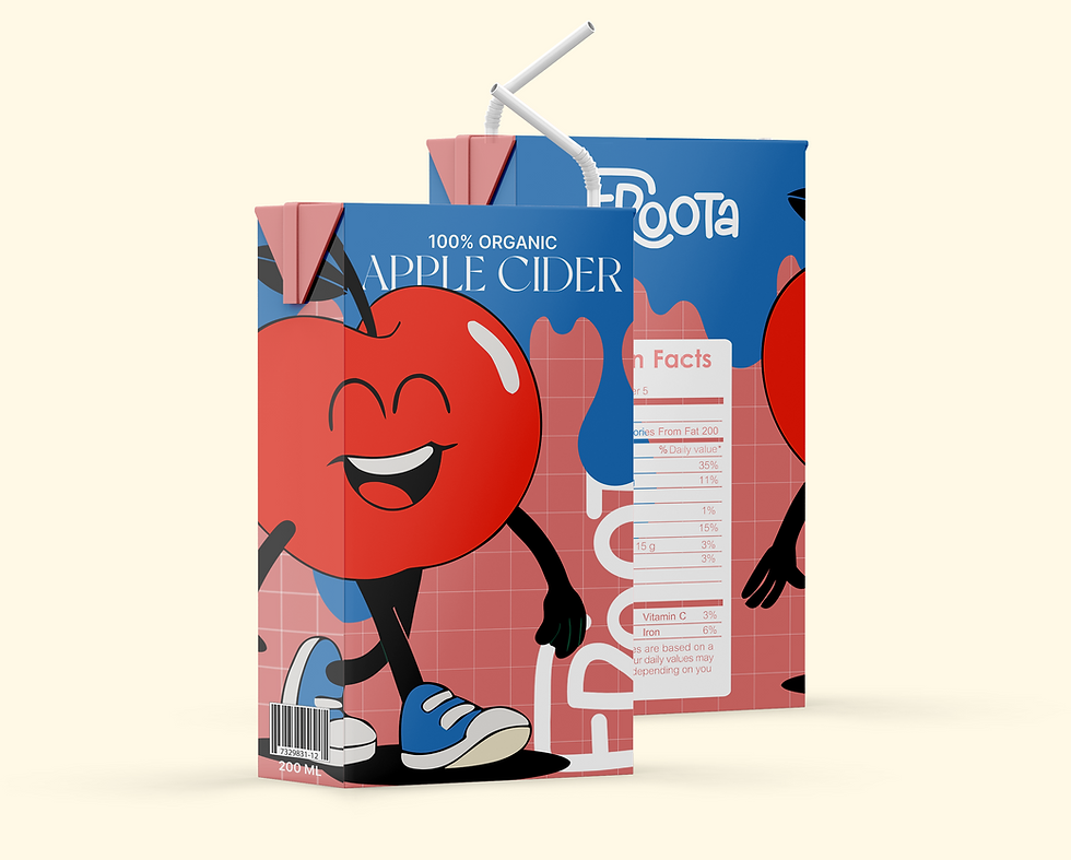
The visual language of the Froota brand is playful, bold, and full of life. It combines flat, vibrant colors with friendly illustrated characters to create an energetic and approachable identity. The design choices-such as rounded typography, expressive fruit mascots, and a joyful tone-are all crafted to appeal to children while maintaining clarity and trust for parents.This consistent and flexible brand language extends seamlessly across packaging, posters, and digital materials, making the product both fun and memorable.


The Froota characters serve as the core ambassadors of the brand’s visual and emotional language. Designed with flat colors, thin contour lines, and bold body language, they make the brand instantly recognizable and memorable.Each character reflects a different mood and taste, allowing the brand to communicate variety, personality, and fun without relying on heavy messaging.Their presence across packaging, posters, and digital platforms creates a strong, playful continuity that kids connect with and parents remember.


The Froota project showcases how brand storytelling, character design, and bold visuals can come together to create an engaging, child-friendly identity. Through playful illustrations, vibrant colors, and a consistent visual language, the brand captures kids’ attention while conveying trust and natural values to parents. This project demonstrates the potential of building not just a product, but an entire branded world that can expand into packaging, merchandise, digital content, and beyond.

THANK YOU FOR MAKING IT THIS FAR, LET'S CREATE SOMTHING TOGEHTER!

BRANDING
FICTIONAL PROJECT
JULY
2025
ILLUSTRAOR
PHOTOSHOP
TWINMOTION
VEO3
NANO BANANA
MIDJOURNEY
DALL-E
Froota is a colorful, cheerful, and natural fruit juice brand for kids. Each box is filled with the taste of real fruit - with no added sugar, no preservatives, and lots of fun. The brand was created to give parents a healthy, refreshing juice option for their children, without compromising on a playful world of cute characters, bright colors, and joy. The illustrated characters convey happiness, friendship, and positive energy, helping to create an emotional connection between kids and the product. The bold, flat colors were chosen to grab attention, evoke freshness, and infuse the brand with a sense of fun, naturalness, and vitality.The combination of real nutritional value and a playful graphic world creates a drinking experience that’s fun, healthy, and unforgettable.